Prepare
to Bloom
Treatment Consultants
When we were first introduced to Prepare to Bloom, it was apparent that this would be one of our most fun projects yet.
Prepare to Bloom approached us looking for a brand identity suite, print collateral, and an updated website. Their current branding and website weren’t quite matching an actual experience with them, so that’s where we stepped in.
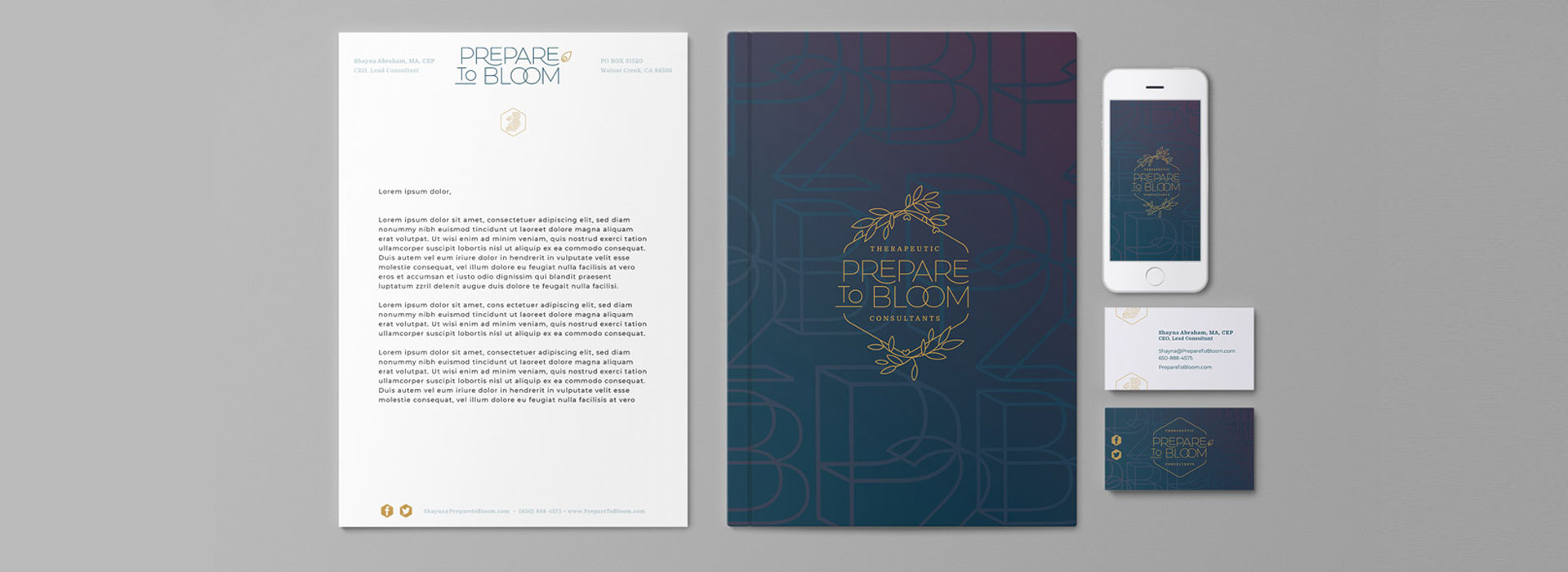
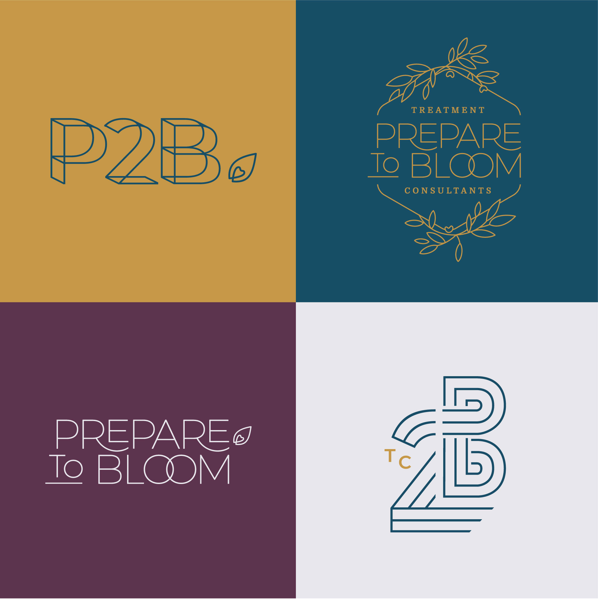
CLIENT:
Prepare to Bloom

LOCATION:
San Francisco, California

DATE:
2018

SERVICES:
Brand Identity
Website
Marketing Collateral
During our initial discovery calls, we discovered just how unique and valuable this team really is. Their approach to therapeutic consulting is very detailed and numbers driven, so we wanted to build a brand identity that was just as unique.
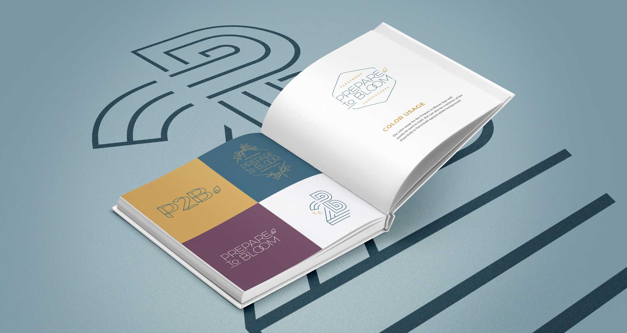
Their main identifiers have two options, which incorporate a clean line, almost surgical approach, while the floral aspects give a sense of motion and growth.
We created a linear iconography set to help keep their brand fresh and alive. For their color palette, we chose plum as a primary color because it combines the calm stability of blue and fierce energy of red. The gold color is associated with achievement, prestige, and sophistication. As the secondary color moves from Dusty Blue to Light Grey, it’s meant to be the impartial, numbers-driven color that balances the scale.
Gold
#C7994A
Plum
#5C334D
Navy
#174D66
Dusty Blue
#ABC4CC
Light Grey
#E8E8ED
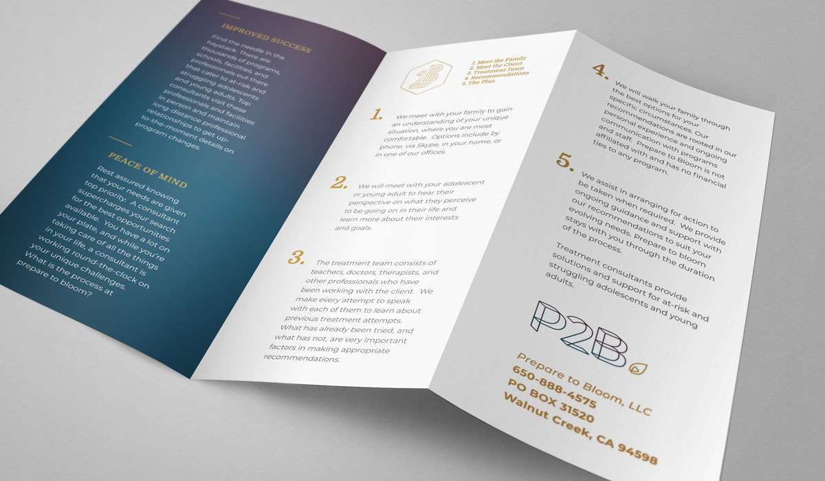
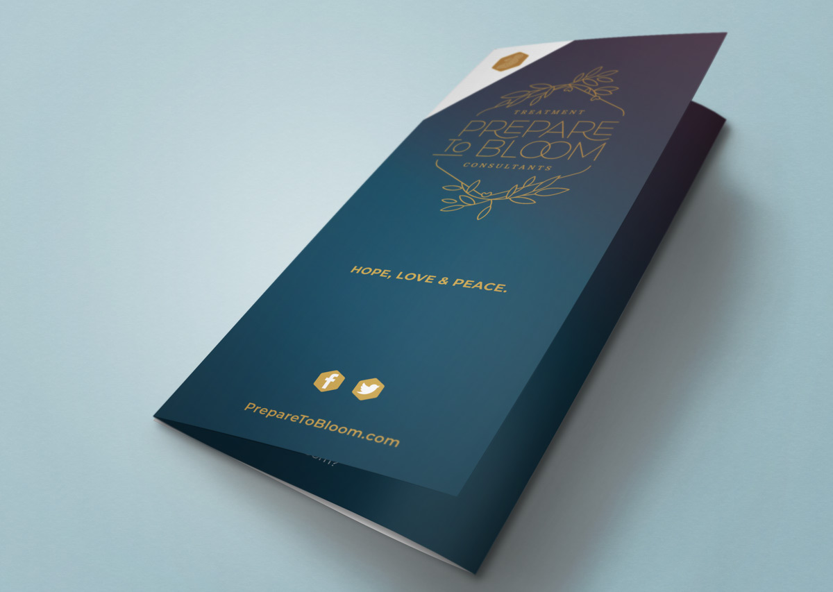
The rest of the brand identity suite and print collateral all utilize the straight line, gradient, strong pop color approach. The end result is the same experience you have when meeting the Prepare to Bloom team… a highly approachable, conversational experience where you leave every encounter knowing more than when you started.